

“Occasionally, I drop a teacup to shatter on the floor on purpose. I’m not satisfied when it doesn’t gather itself up again. Someday, perhaps, that cup will come together.” – Hannibal Lecter
- Dining Room: Classic Color Palette with a Twist

Gorgeous indigo blue with gold accents made more interesting with the unusual planking on the walls. The walls are made of a variety of curvy moldings laid in like planking.

I wish all movie and television sets were so thoughtfully and creatively designed and styled as NBC’s Hannibal. It’s moody, introverted, classic yet with an edge of the strange and it’s gorgeous to look at. I love the all white Scandinavian style that has taken the design world by storm however, this is a lush, dark and elegant antidote that feels like a breath of fresh air.

The herb garden wall is quite beautiful, albeit spooky – here’s a more detailed image with actor Mads Mikkelsen:

I would love to take this idea for a children’s room and use a colorful mural and have tiers of boxed shelves that hold books and games.
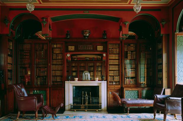
2. Dark and Handsome Library with Neoclassical Details


3. Symmetry and…Asymmetry

It’s easy to forget that if you want a formal look, you don’t always have to go with rigid symmetry. The mantel and the objects framing it are placed symmetrically while the art and other pieces are asymmetrical.
I am thoroughly enchanted with the darkly elegant, classical with a touch of the strange, world that this set creates. It would be interesting to take some of this and apply it to a room in your own home.
Sources: Here’s an interesting interview with the production designer from the L.A. Times and then a great photo gallery. Sir John Soane’s Museum. And the blog from Hannibal. Quote from Hannibal Quotes Blog.

3 thoughts on “Classic with a Touch of the Strange: The Set of Hannibal”