


This home is a beautiful, old Park Hill home built in the early 1900’s. It has the original dark wood trim, original tile fireplace, a beautiful entry staircase, intact stained glass everywhere and a front porch I could probably live in full time. You would not know any of this though from the above photo. The kitchen was a dark, cherry wood-filled place with red floor tile and was added to the back of the house (along with an awkwardly shaped family area) in maybe the early 1990’s.
This client wanted her kitchen to feel a part of the rest of her vintage home. She and her family love to cook and the existing kitchen was not a homey spot that anyone really wanted to linger in for long. To save a bit of money, she wanted to keep as many cabinets as she could. We went round and round on color cabinets versus white cabinets. She ultimately chose a timeless white – which has turned out to be so cheerful and easy to style. Here’s our after:

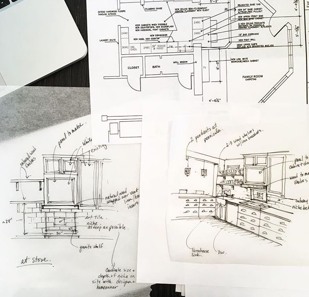
I happily got rid of the angle at the sink – there was something about it that the client and I didn’t like. We also demo’ed the lower height peninsula that came out into the kitchen. She didn’t have quite enough room for an island, so we opted for a piece of furniture instead. We kept the other major appliances where they were to help keep the new cabinet pieces down to a minimum. We added new granite countertops (a soapstone look-alike) on the right and a reclaimed wood countertop on the left (from Barns 2 Home).

We also demo’ed the fast food restaurant tile (found asbestos underneath and chose to leave in site and cover over) and had hardwood floors continue into this room to match the rest of the home.


I had the upper cabinets over the sink removed to help with the strong Wall O’Cabinet feeling in the room and we took the subway tile all the way up to add more shine to the area. There is one small window in this room and the very tall cabinets that lined both sides of the room added to the oppressive feel. The client had plenty of storage space (enviable) so the uppers weren’t necessary. We did add a niche above the stove for oils and to display an art tile the client loved. I love this cheery kitchen now – and I love that we didn’t knock any walls down or demolish all the cabinets to achieve it! While this definately wasn’t inexpensive, it’s still much less expensive than buying all new cabinets – it’s also a great thing to re-use what you have rather than discarding the old.

Here’s a gif of Before and After photos!


Looks fabulous. After is definitely better than before
Thanks Julie!
The Transformation is unbelievably amazing…The perfect use of light shades gives a very elegant look…Thanks for sharing this amazing post..Feeling Inspired!
Thank you!
I absolutely love every element. I only wish there were more photos! One of my top 5 dream kitchens.
Hey Thanks Michelle! That’s very kind of you. I’m kind of kicking myself for not getting more photos too. We put in a sweet little window seat in one part of it that her kids use and it might have been nice to show the double ovens and pantry…thanks again for your nice words. 🙂
Popped over from Apartment Therapy…..I do wish there were more photos! What a fantastic job y’all did on an unpleasant kitchen! It doesn’t look like it’s the same home. And kudos on reusing as much of the existing cabinetry as was possible.
Thank you very much. I was really happy to be able to re-use the cabinets. There’s no need to always tear things out! Thanks for stopping by – Laura
The photographer found a nice photo of this kitchen from that same day looking towards the double ovens and window seat – I added it to the post in case anyone is interested! 🙂