


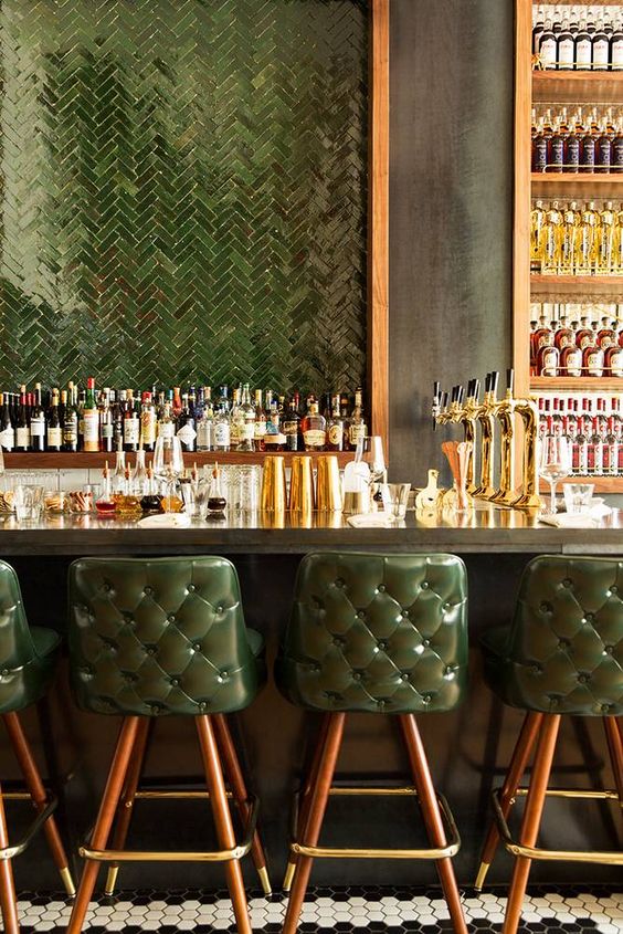
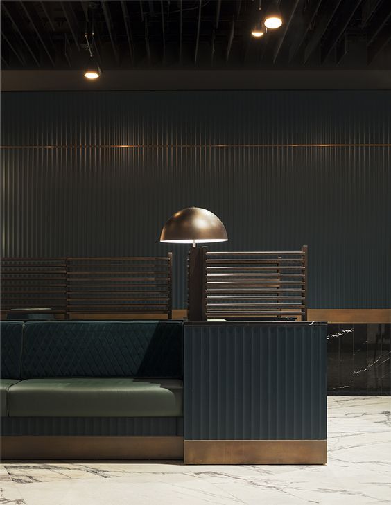
As most of my design work will attest to, I love “light and bright” interiors. One of my favorite interior paint colors is “Simply White” (sadly true and kind of funny). However, this time of year I am ready to flip the switch and go all out dark and moody. I’ve been taken in recently by dark restaurants. There is a little bit of the theatre in some restaurants with a dark color palette. There’s an atmosphere of romance, excitement and a sense that time could be passing at a rapid rate outside, but it wouldn’t matter because you’re inhabiting a separate world.
“But even modest restaurants offer the opportunity to become someone else, at least for a little while. Restaurants free us from mundane reality; that is part of their charm. When you walk through the door, you are entering neutral territory where you are free to be whoever you choose for the duration of the meal.” – Ruth Reichl

I’d love to capture some of that restaurant magic and bring it into the home. I generally like a neutral palette with art, plants, accessories, people and pets as the “topping,” but one of the rooms where I think you can easily make an exception, is your dining room. I think going darker and more saturated with some of your large area color choices (in other words, it takes more than adding a few pillows and a painting) would give you some of that restaurant “theatre” drama. It might give you an opportunity to inhabit a space in your own home that’s separate from every day. Choose a dark, jewel tone that speaks to you and go for it.

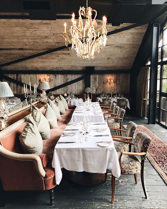


I do like white interiors, I even like white dining rooms but this dark side is so much more interesting to me right now. I have a dark kitchen and instead of trying to lighten it up, I went even darker with it and painted the old cabinets black. It adds drama to an otherwise not very interesting space. However, I have to admit, it is a bit dark in there sometimes now that the time has changed and I’m fixing dinner after the sun has set. I think a dining room is a more ideal space to go for a dark and theatrical atmosphere using tone on tone saturated color. What do you think? Any plans to change up your dining room before Thanksgiving? Or, are you like me, and entirely lacking a formal dining space?
“The sky grew darker, painted blue on blue, one stroke at a time, into deeper and deeper shades of night.”
― Haruki Murakami, Dance Dance Dance

Nice post https://cgiflythrough.com